UX Component - User-Defined Sub-Themes
Description
Most of the Javascript controls on a UX component support the concept of 'sub-themes'. This topic discusses how user-defined sub-themes can be added to a UX component.
The sub-theme sets style and behavior properties of the control. Out of the box, each control type comes with one or more built-in sub-theme. For example, the Button control type comes with the following built-in sub-themes:
base
left
right
confirm
deny
action
Every control type has a sub-theme of 'base' and this sub-theme is implied if no sub-theme is explicitly set. The sub-themes for a given style (e.g. iOS, MobBlue, etc.) are defined in the style.js file in the folder with the same name as the style. (e.g. CSS\iOS\style.js) Developers can define their own sub-themes by adding code to the style.js file, (in which case the new sub-theme will be available to all components that use a particular style), or by adding the sub-theme in as a 'locally' defined sub-theme as part of the UX component.
To define a local sub-theme, use these properties in the UX builder:

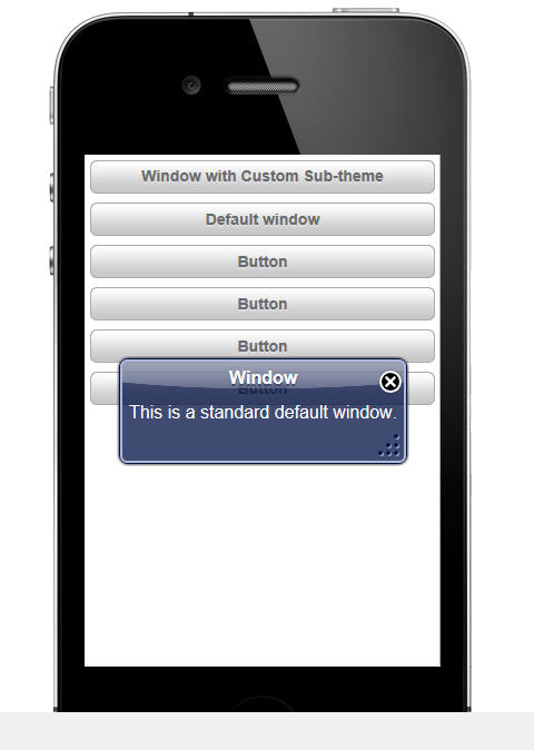
A sub-theme typically has both a Javascript aspect to it and a CSS aspect. In the image below, a window with the default appearance for a window using the iOS theme is shown. In the builder where this window was defined, no sub-theme was specified (which means that the 'base' window sub-theme was used)
However, in this next image, a custom sub-theme for the window was used. The appearance of the window has been completely changed as a result of applying the sub-theme. Notice that the window does not have a title, it is semi transparent (you can see the controls that are behind it), and the close button is positioned slightly above and to the right of the top right corner of the window.

To define this new window sub-theme, the following code was added in the 'Local sub-themes definition - Javascript' property of the UX component:
{
    window: {
        customSubTheme: {
            className: 'customWindow',
            title: {
                className: 'customWindowTitle',
                tools: {
                    inset: '-12px',
                    verticalInset: '-12px'
                }
            },
            body: { className: 'customWindowBody'},
            _defaultTools: {
                'close' : {
                    action: 'close',
                    name: 'close',
                    image: 'css/iOS/winClose.png'
                }
            }
        }
    }
}In addition, the following code was added in the 'Local sub-themes definition - CSS' property:
.customWindow {
    background:rgba(0,0,0,.5);
    color: white;
    border-radius: 10px;
}
.customWindowBody { padding: 10px; text-shadow: none;}
.customWindowTitle { overflow:hidden; height: 0px; }
The Javascript shown above for the local sub-theme definition is a simple JSON object. The JSON object defines an object called 'window' which is the type of control for which the sub-theme is being defined. Within the 'window' object, a sub-theme called 'customSubTheme' has been defined. In this case only additional sub-theme for the 'window' class was defined, but you would define an unlimited number of window sub-themes. The sub-theme simply defines CSS class names to use for various aspects of the window and also defines other properties. For example, the 'inset' and 'verticalInset' properties define the placement of the window 'tools' relative to the top, right corner of the window (in this case, the only 'tool' is the close button).